Improve UX with Effective Visual Hierarchy | Web Design Tips

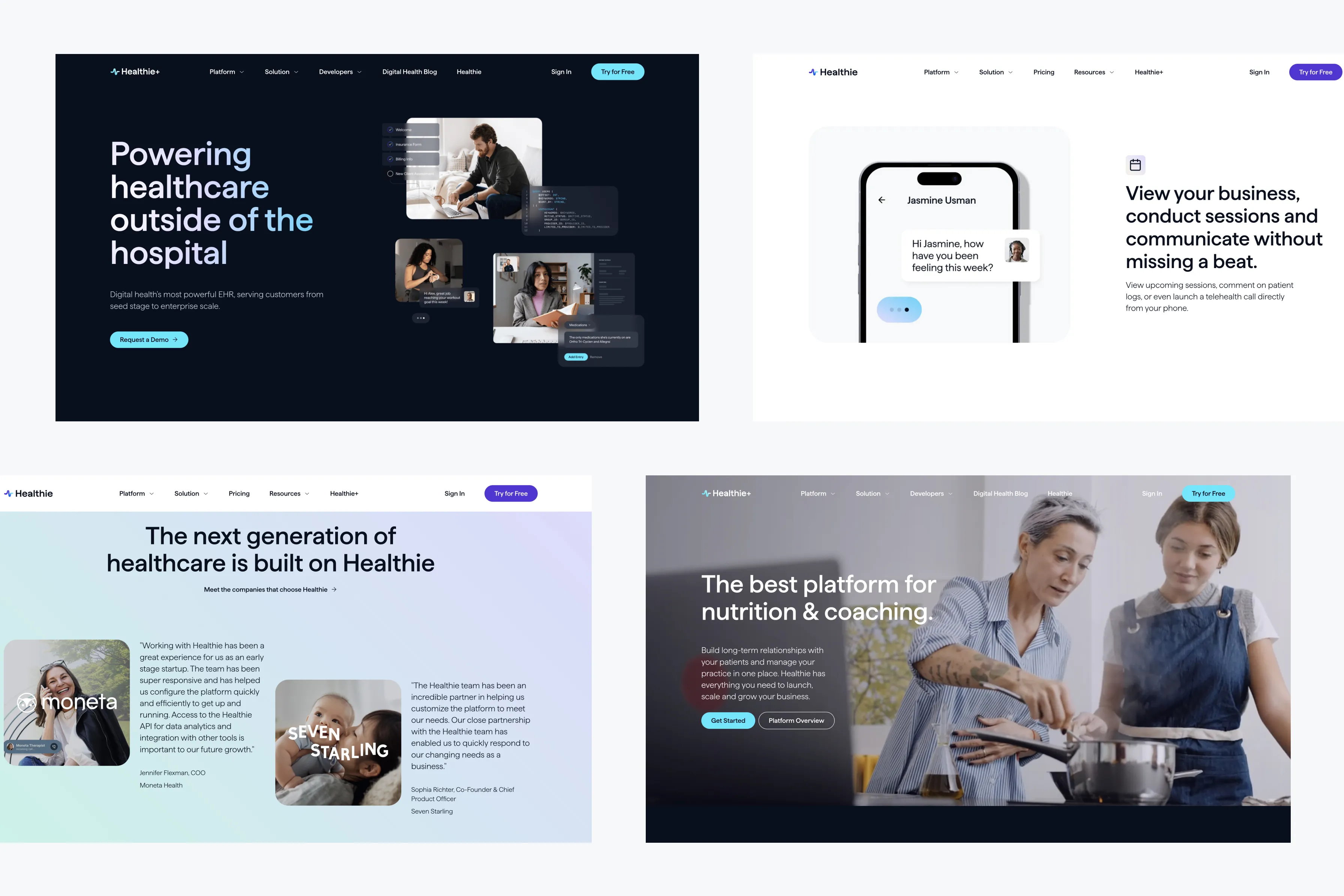
In web design, visual hierarchy plays a critical role in guiding users through your content and ensuring they can easily find the information they need. By organizing elements on the page in a way that reflects their importance, you can create a more intuitive and engaging user experience. In this blog, we’ll explore how to enhance your website’s user experience through effective visual hierarchy.
1. Understanding Visual Hierarchy
Visual hierarchy refers to the arrangement and presentation of elements on a webpage, designed to guide the user’s eye to the most important information first. This concept relies on principles like size, color, contrast, and positioning to establish a clear order of importance.
Key Elements:
- Size and Scale: Larger elements naturally draw more attention. Use larger fonts and images to highlight key information or calls to action (CTAs).
- Color and Contrast: Bright or contrasting colors can make important elements stand out. Use color to differentiate between primary and secondary content.
- Positioning: Place important elements higher on the page or in prominent locations where users are likely to look first.
2. Structuring Content for Clarity
Clear content structure is essential for effective visual hierarchy. Users should be able to scan your webpage quickly and understand the main points without getting lost in unnecessary details.
Best Practices:
- Headings and Subheadings: Use headings to break up content into digestible sections. Subheadings can further organize content and guide the user’s reading flow.
- Bullet Points and Lists: Bullet points and numbered lists make content easier to scan and can help emphasize key information.
- Whitespace: Don’t be afraid to use whitespace to separate content and reduce clutter. Whitespace can help important elements stand out and improve readability.
3. Prioritizing Calls to Action (CTAs)
CTAs are among the most critical elements on your website, driving users to take desired actions like signing up, making a purchase, or contacting you. Effective visual hierarchy ensures that CTAs are easily noticed and acted upon.
Best Practices:
- Prominent Placement: Place CTAs in high-visibility areas, such as above the fold or at the end of a section where users have absorbed relevant information.
- Contrast and Color: Use contrasting colors to make CTAs stand out from the surrounding content. Bright, bold colors can draw attention to these crucial elements.
- Button Size: Ensure CTA buttons are large enough to be easily clicked on both desktop and mobile devices.
4. Guiding the User Journey
Visual hierarchy should guide users through your website in a logical, intentional way. By considering the natural flow of information, you can create a seamless user journey that leads to higher engagement and conversions.
Best Practices:
- Flow and Direction: Arrange content in a way that naturally leads the user from one section to the next. Consider the visual flow from top to bottom and left to right.
- Visual Cues: Use arrows, lines, or other visual cues to direct the user’s attention to the next step or important information.
- Progressive Disclosure: Reveal information gradually, starting with the most critical points and allowing users to explore further if they’re interested.
5. Testing and Refining Visual Hierarchy
As with any aspect of web design, testing and iteration are key to refining your visual hierarchy. What works well for one audience or industry might not be as effective for another, so it’s important to test different approaches and gather user feedback.
Best Practices:
- A/B Testing: Conduct A/B tests with different layouts, colors, and sizes to see which configurations result in higher engagement or conversion rates.
- User Feedback: Gather feedback from real users to understand how they interact with your website and whether they can find the information they need easily.
- Analytics: Use web analytics tools to track user behavior, such as click-through rates and time spent on pages, to identify areas where the visual hierarchy might need adjustment.
Conclusion
Effective visual hierarchy is essential for creating a user-friendly website that guides visitors through your content intuitively. By applying these principles—prioritizing content, structuring information clearly, and placing CTAs strategically—you can enhance the user experience and increase the likelihood of achieving your website’s goals. Remember, the key to success is continuous testing and refinement to ensure your visual hierarchy meets the needs of your users.


