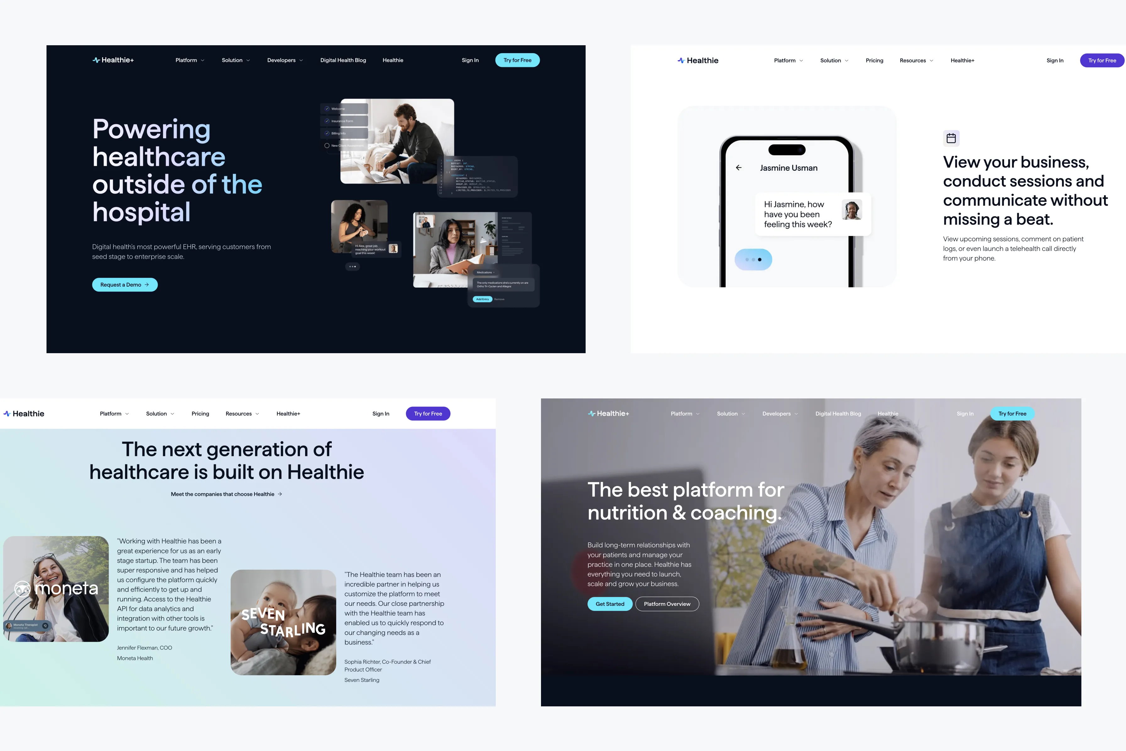
Boost User Engagement with Micro-Animations | Web Design Tips

Micro-animations have become a powerful tool in web design, helping to guide users, provide feedback, and enhance the overall user experience. These small, subtle animations can make a significant impact on how users interact with your website, leading to higher engagement and satisfaction. In this blog, we’ll explore how to effectively use micro-animations in your web design to boost user engagement.
1. Understanding Micro-Animations
Micro-animations are small, functional animations that help users interact with a website more intuitively. They can guide users through a process, provide visual feedback on interactions, or simply add a touch of delight to the user experience.
Examples of Micro-Animations:
- Hover Effects: Animations that trigger when a user hovers over a button, link, or image, indicating that the element is interactive.
- Loading Indicators: Small animations that show users their action is being processed, reducing perceived wait time.
- Form Feedback: Animations that provide real-time feedback as users fill out forms, such as checkmarks for correctly filled fields.
2. Enhancing Navigation with Micro-Animations
Micro-animations can make navigating your website more intuitive by providing users with visual cues about where they are and where they’re going next.
Best Practices:
- Breadcrumb Trails: Use subtle animations to highlight the user’s current location within a navigation trail.
- Menu Interactions: Implement smooth transitions when users open or close a navigation menu, enhancing the flow of the experience.
- Progress Indicators: Show progress through a process (like checkout) with animated steps, keeping users informed and engaged.
3. Improving Form Interactions
Forms are a crucial part of many websites, whether for sign-ups, contact, or checkout. Micro-animations can make the process smoother and more engaging, reducing the likelihood of user frustration.
Best Practices:
- Inline Validation: Use micro-animations to provide instant feedback when users enter information into form fields. For example, a green checkmark can appear when an email address is entered correctly.
- Animated Placeholders: Employ animations to move placeholder text out of the way as users begin typing, ensuring that the field’s purpose remains clear.
- Submit Confirmation: After a user submits a form, a small animation can confirm the action, like a spinning wheel that turns into a checkmark.
4. Adding Delight with Subtle Interactions
Beyond functionality, micro-animations can add a layer of delight to your website, making the user experience more enjoyable and memorable.
Best Practices:
- Button Animations: Apply a subtle animation when users hover over or click buttons, adding a tactile feel to digital interactions.
- Content Reveals: Use animations to reveal content as users scroll, creating a dynamic experience that keeps them engaged.
- Icon Transitions: Animate icons that change to indicate a state, such as a heart icon that fills in when a user likes something.
5. Avoiding Overuse
While micro-animations can enhance user engagement, it’s important not to overdo them. Too many animations can overwhelm users and slow down your website.
Best Practices:
- Purpose-Driven Animations: Only use micro-animations where they serve a clear purpose, such as improving navigation, providing feedback, or enhancing the user experience.
- Performance Considerations: Ensure that animations are lightweight and don’t negatively impact page load times.
- Consistency: Maintain consistency in the style and behavior of animations across the site to avoid confusing users.
Conclusion
Micro-animations are a powerful tool for enhancing user engagement in web design. When used thoughtfully, they can guide users, provide feedback, and add delight, all of which contribute to a more engaging and enjoyable user experience. By incorporating micro-animations into your design strategy, you can create a website that not only functions smoothly but also leaves a lasting impression on your users.


