Intuitive Navigation Best Practices | Improve Website Usability


Navigation is one of the most critical elements of web design. Intuitive navigation ensures that users can easily find what they’re looking for, leading to a more satisfying and efficient user experience. Poor navigation can frustrate users, increase bounce rates, and diminish the overall effectiveness of a website. In this blog, we’ll explore the best practices for designing intuitive navigation in web design.
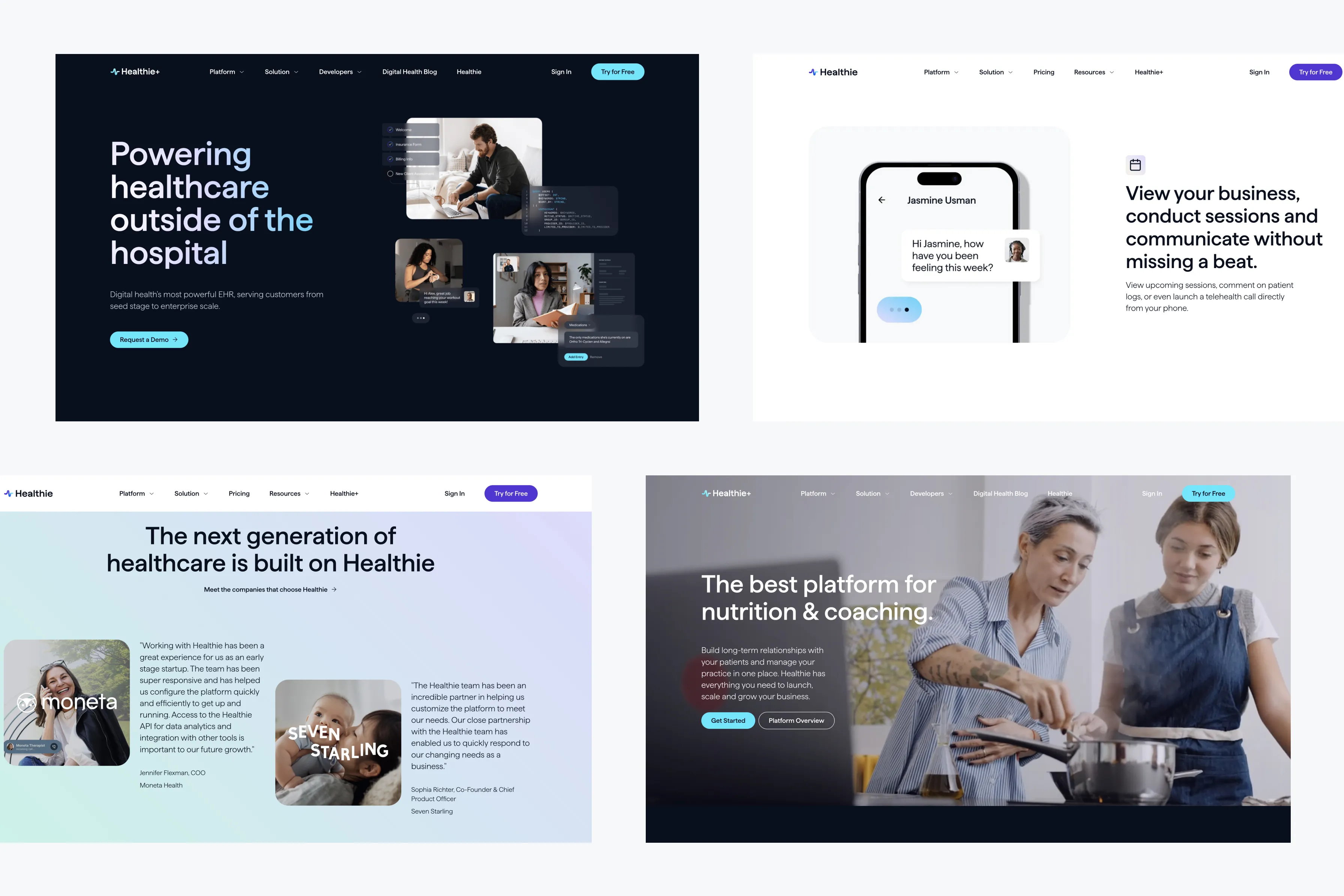
1. Keep It Simple and Consistent
Simplicity and consistency are key to creating intuitive navigation. Users should be able to understand the navigation structure at a glance, with clear labels and consistent placement of menu items across all pages.
Best Practices:
- Use Clear Labels: Label navigation items with familiar, descriptive terms that users can easily understand, like “Home,” “About,” “Services,” and “Contact.”
- Limit Menu Items: Avoid overwhelming users with too many choices. Limit the number of primary menu items to around 5-7 to keep navigation simple and focused.
- Consistent Placement: Place navigation menus in familiar locations, such as the top of the page or a sidebar, and keep their position consistent across all pages.
2. Implement User-Centered Design
User-centered design focuses on the needs and behaviors of your users when designing navigation. By understanding how users interact with your site, you can create a navigation structure that aligns with their expectations.
Best Practices:
- Conduct User Research: Use surveys, interviews, and usability testing to understand how users navigate your site and what they expect to find in the navigation menu.
- Create User Personas: Develop personas that represent different segments of your audience to guide your navigation design decisions.
- Test and Iterate: Continuously test your navigation with real users and make iterative improvements based on their feedback.
3. Prioritize Mobile Navigation
With the increasing use of mobile devices to access websites, it’s essential to design navigation that works well on smaller screens. Mobile navigation should be easy to access and use, without requiring excessive scrolling or tapping.
Best Practices:
- Responsive Navigation: Implement responsive design techniques to ensure that navigation adapts to different screen sizes. Consider using hamburger menus or collapsible menus for mobile devices.
- Touch-Friendly Design: Ensure that navigation items are large enough to be easily tapped on mobile screens, with sufficient spacing to avoid accidental clicks.
- Sticky Menus: Use sticky menus that remain visible as users scroll down the page, making it easy for them to access the navigation without scrolling back to the top.
4. Use Visual Hierarchy
Visual hierarchy in navigation helps users quickly understand the structure of your site and find the information they need. By organizing navigation items visually, you can guide users to the most important sections of your site.
Best Practices:
- Prioritize Important Links: Place the most important navigation items at the beginning or end of the menu, where they are most likely to be noticed.
- Use Dropdown Menus: Dropdown menus can organize subpages and reduce clutter in the main navigation, but use them sparingly to avoid overwhelming users.
- Highlight Active Pages: Clearly indicate the user’s current location within the site by highlighting the active page in the navigation menu.
5. Enhance Findability with Search
In addition to navigation menus, a well-designed search function can greatly enhance the findability of content on your website. Users who prefer searching over browsing should be able to easily locate and use the search feature.
Best Practices:
- Prominent Search Bar: Place the search bar in a prominent location, such as the top right corner of the page, where users expect to find it.
- Autocomplete Suggestions: Implement autocomplete functionality that suggests popular search terms as users type, helping them find what they’re looking for faster.
- Search Filters: Provide search filters that allow users to narrow down results based on categories, date ranges, or other relevant criteria.
Conclusion
Designing intuitive navigation is essential for creating a positive user experience and improving the usability of your website. By keeping navigation simple and consistent, focusing on user needs, prioritizing mobile navigation, using visual hierarchy, and enhancing findability with search, you can create a navigation structure that guides users smoothly through your site. Remember, the key to effective navigation design is continuous testing and refinement to ensure it meets the needs of your audience.


